What are the main objectives of app design?
Table of Contents
What is App Design?
App design is the process of creating attractive and intuitive user interfaces for mobile applications. This approach includes both functional components like navigation, usability, and user interaction, as well as aesthetic components like colors, fonts, and layout.
The main objective of app design is to guarantee a smooth and engaging user experience, which eventually results in increased satisfaction and engagement. Read the detailed guide on Guide to enterprise mobile app development.
The Complexity mobile app design concentrates on creating aesthetically pleasing and incredibly useful user interfaces. guarantees that users can interact and use the app with ease, improving their overall pleasure.
The development of software applications for mobile devices is often referred to as mobile app design. It includes a wide range of components, such as typography, color schemes, icons, layout, and interaction patterns. Every element of the app is made to be user-friendly and entertaining, guaranteeing a flawless user experience.
Check the following blog Examining Our All-Inclusive UX Design Services: From Concept to Clicks
Where Your App Will Shine
Though there are many exciting opportunities in the digital world, where will your software make its big debut? The platform you choose impacts accessibility, establishes the tone, and eventually determines the size of your audience. It's similar to picking the ideal stage for your product.
iOS and Android are the two titans that rule this exciting field. Every one of them has a devoted fan base and unique design principles. Now let's explore the captivating world of platform selection:

iOS App Design
Apple's Human Interface Guidelines (HIG) are followed while designing iOS apps. These rules place a strong emphasis on depth, clarity, and simplicity. Crucial components consist of
- Navigation: To guarantee a comfortable user experience, employ common navigation elements like tab bars and navigation bars.
- Gestures: To improve interactivity, use standard motions like pinching and swiping.
- Typography: For similarity and readability, Apple suggests using the San Francisco typeface.
- Graphics and Icons: To work with Retina displays, graphics should have a high quality and be easily recognisable.
Android App Design
Google's Material Design guidelines serve as a reference for Android app design. The creation of a dependable and understandable user experience is the main goal of these guidelines. Principal components consist of:
- Content Metaphor: To create a sense of familiarity, design components should resemble real-world materials.
- Bold, Graphic, and Beneficial: To make a visually attractive design, use large images, bold colors, and intentional white space.
- Gestures: Use slick, organic animations to help consumers navigate the app.
- Adaptive User Interface: Create content with different screen sizes and resolutions in mind to make sure it looks well on all kinds of devices.
Read more about Fundamental Concepts for UI/UX Design
Key Principles of Mobile App Design
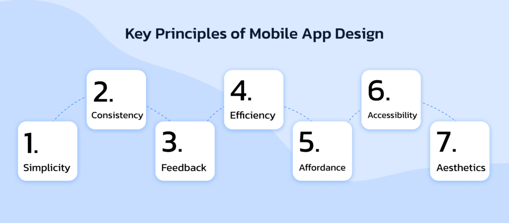
- Simplicity: Maintain an organized, functionWhat is the difference between UX and UI design in mobile appsal style. Easy-to-use navigation and content importance are two benefits of simple design.
- Consistency: Make that the application uses consistent buttons, icons, and fonts. speeds up the process of getting people used to the interface.
- Feedback: Give users' activities instant feedback. tactile feedback, auditory cues, or visual signals.
- Efficiency: Create apps with the least amount of work required from users to accomplish goals. consists of reducing the amount of steps needed to finish an activity.
- Affordance: Clearly state which parts are interactive. Actionable objects such as buttons and links should be prominently displayed.
- Accessibility: Features like text size adjustments, screen readers, and high contrast settings should be included in designs for users of various abilities.
- Aesthetics: Design an eye-catching interface that represents the app's brand identity and improves the user experience.
Best Practices in Mobile App Design
- Understand Your Users: To comprehend the requirements, inclinations, and behaviors of your target audience, conduct user research.
- Prioritize Performance: To provide users a satisfying experience, make sure the app launches swiftly and functions well.
- Optimize Various Devices: Create content with different screen sizes and resolutions in mind to make sure it looks well on all kinds of devices.
- Put intuitive navigation to use: To make it easier for consumers to discover what they need, make advantage of well-known navigational cues like side menus and bottom tabs.
- Test Often: To find and fix problems early, evaluate usability at every stage of the design process.
- Remain Current: To keep your app feeling fresh and new, stay current with platform rules and design trends.
Tools for Designing for Mobile Devices
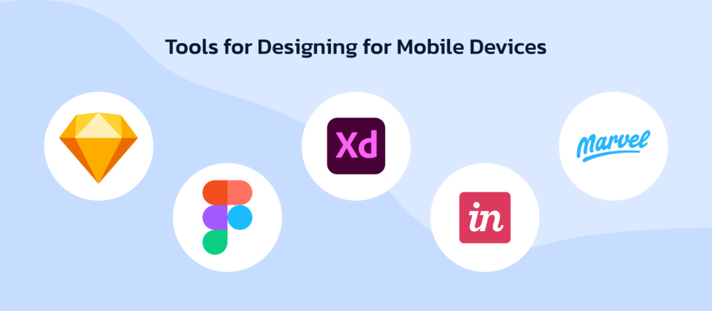
- Sketch: An editor for vector graphics used to create high-fidelity designs, prototypes, and wireframes.
- Figma: A tool for collaborative design that enables several designers to work on the same project at once.
- Adobe XD: A flexible instrument for creating and testing user interfaces.
- InVision: An interactive mockup tool for designers to receive feedback on their designs.
- Marvel: A design tool that makes the process of creating interactive prototypes from sketches easier.
Mobile Application Design Process
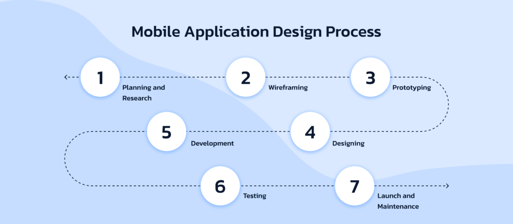
- Planning and Research: Plan the features and functionalities of the app, identify the target market, and specify its objectives.
- Wireframing: Make low-fidelity wireframes to illustrate the layout and structure of the application.
- Prototyping: Create interactive prototypes to see how users will engage with the design and get input.
- Designing: Produce intricate designs with great accuracy, using precise color schemes, typefaces, and imagery.
- Development: Work together with developers to guarantee that the design is executed correctly.
- Testing: Test usability to find and address any problems.
- Launch and Maintenance: Launch the app and keep it updated in response to user input and evolving requirements.
Creating Wireframes and App Mockups
In the app design process, wireframes and app mockups are crucial resources. Mockups are more intricate illustrations that use color, font, and pictures, whereas wireframes are simple drawings that show the organization and design of an application. Before production starts, these tools aid designers in visualizing the functionality and flow of the programme. Adobe XD, Figma, and Sketch are popular programmes for making wireframes and mockups.
What Do you think what was The Need for Interactive Website Design?
App Design Tips for the Best User Experience
Display and Screen Orientation
Design an application that works on a range of screen sizes and orientations. Make sure your software works and looks good in both landscape and portrait orientations. Test your design on a variety of devices to find and address any layout problems.
Responsiveness
A consistent user experience is offered across all platforms thanks to responsive design, which adjusts to various screen sizes and resolutions. To accomplish responsiveness, make use of scalable pictures, modifiable text sizes, and adaptable grid layouts.
Call-to-Action
Call-to-action (CTA) buttons that work effectively direct visitors to do desired tasks, such purchasing, joining up, or sharing information. Ensure that your call to action buttons are prominent, succinct, and placed thoughtfully across the application.
Eliminate Distractions
Reduce the amount of distractions keeping the design simple and clutter-free. Eliminate extraneous components and concentrate on your app's primary features. keeps users interested in and concentrated on their jobs.
How to Achieve the Best Mobile App Design: 7 UI Principles

- Clarity: Make sure there are no confusing steps for consumers to grasp when using the app.
- Consistency: To provide a smooth experience, keep the app's appearance constant throughout.
- Feedback: Use messages or animations to provide users feedback on what they've done.
- Efficiency: Make the software such that users may do tasks fast and effectively.
- Accordance: Indicate which interactive items can be swiped or tapped.
- Accessibility: Make sure the app is user-friendly for people of all skill levels by designing it for them.
- Aesthetics: Design something that looks good and improves the user experience.
Awesome Mobile App Design Examples
- Spotify: Well-known for having an easy-to-use interface that makes finding music simple.
- Airbnb: Provides a user-friendly and aesthetically beautiful interface for making hotel reservations.
- Duolingo: Makes learning a language pleasant by engaging users with an entertaining and colorful interface.
Useful Tools for Mobile App Design
- Sketch: An increasingly used tool for prototype and wireframe creation.
- figma: A collaborative design tool that facilitates the simultaneous collaboration of numerous designers on a given project.
- Adobe XD: Gives designers and developers of mobile apps access to a full toolkit.
Conclusion
Building mobile apps should include app design. You can create a visually appealing and highly functional app by understanding the precise design concepts specific to iOS and Android, creating proper wireframes and mockups, and implementing user experience best practices. Use the user puts your design process in the middle with lots of testing to guarantee maximum experience And be iterative.
The process of creating attractive and user-friendly interfaces for mobile applications is called mobile app design. Continuous iteration and testing is essential to improve design and ensure that designers can create applications that deliver amazing user experiences by using the right tools, adhering to best practices, and by applying basic design concepts.


